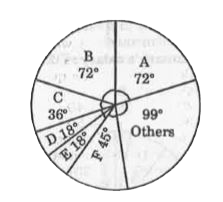
Home
Class 14
MATHS
The following Pie Chart shows the export...

The following Pie Chart shows the export of different foodgrains from India in 2010. Study the chart and answer the questions :

If a total of 1.5 million quintals of crop F was exported, the amount of total foodgrains exported (in million) quintals was

A

8.7

B

12

C

10.8

D

9.6

Text Solution

Verified by Experts

The correct Answer is:
B
Promotional Banner

Topper's Solved these Questions

  • STATISTICS AND DATA INTERPRETATION

    KIRAN PUBLICATION|Exercise TYPE-VIII|8 Videos
  • STATISTICS AND DATA INTERPRETATION

    KIRAN PUBLICATION|Exercise TYPE-VI|86 Videos
  • SIMPLIFICATION

    KIRAN PUBLICATION|Exercise TEST YOURSELF|25 Videos
  • TIME AND DISTANCE

    KIRAN PUBLICATION|Exercise Type -XI|74 Videos

Similar Questions

Explore conceptually related problems

The following Pie Chart shows the export of different foodgrains from India in 2010. Study the chart and answer the questions : If a total of 1.5 million quintals of crop F was exported, then the total quantity of D and E that was exported (in million quintals) was

The following Pie Chart shows the export of different foodgrains from India in 2010. Study the chart and answer the questions : Of the total export of foodgrains, the percentage of crop B exported is

The following Pie Chart shows the export of different foodgrains from India in 2010. Study the chart and answer the questions : The three crops which combine to contribute to exactly 50% of the total export of foodgrains are

The following Pie Chart shows the export of different foodgrains from India in 2010. Study the chart and answer the questions : If the revenue from 1 quintal of crop A is thrice that from 1 quintal of crop C, then the ratio of the total revenues of A and C is

The following pie chart shows percentage expenditure of a country on different heads .The total expenditure is Rs. 1,680 (in billions).Study the chart and answer the question. The total amount of expenditure for education and Health (in billions Rs. )is:

The line graph shows the exports by a certain company. Study the diagram and answer the following questions. What were the total exports (in Rs lakhs) by the company in the last four years?

The Pie Charts shows the expenditure of a country on various sports during a particular year. Study the graph and answer the questions: If the total amount spent on cricket and hockey together is Rs 80,000 then total expenditure on all sports?

KIRAN PUBLICATION-STATISTICS AND DATA INTERPRETATION-TYPE-VII
  1. The pie-chart given below shows the number of students enrolled in a s...

    Text Solution

    |

  2. The following Pie Chart shows the export of different foodgrains from ...

    Text Solution

    |

  3. The following Pie Chart shows the export of different foodgrains from ...

    Text Solution

    |

  4. The following Pie Chart shows the export of different foodgrains from ...

    Text Solution

    |

  5. The following Pie Chart shows the export of different foodgrains from ...

    Text Solution

    |

  6. The following Pie Chart shows the export of different foodgrains from ...

    Text Solution

    |

  7. Following is the pie-chart showing the spendings of a family on variou...

    Text Solution

    |

  8. Following is the pie-chart showing the spendings of a family on variou...

    Text Solution

    |

  9. Following is the pie-chart showing the spendings of a family on variou...

    Text Solution

    |

  10. Following is the pie-chart showing the spendings of a family on variou...

    Text Solution

    |

  11. Following is the pie-chart showing the spendings of a family on variou...

    Text Solution

    |

  12. The Pie-chart shows the result of a survey among 119060 people concern...

    Text Solution

    |

  13. The Pie-chart shows the result of a survey among 119060 people concern...

    Text Solution

    |

  14. The Pie-chart shows the result of a survey among 119060 people concern...

    Text Solution

    |

  15. The Pie-chart shows the result of a survey among 119060 people concern...

    Text Solution

    |

  16. The Pie-chart shows the result of a survey among 119060 people concern...

    Text Solution

    |

  17. The following pie-chart shows the preference of musical instruments of...

    Text Solution

    |

  18. The following pie-chart shows the preference of musical instruments of...

    Text Solution

    |

  19. The following pie-chart shows the preference of musical instruments of...

    Text Solution

    |

  20. The following pie-chart shows the preference of musical instruments of...

    Text Solution

    |