A
B
C
D
Text Solution
Verified by Experts
The correct Answer is:


Topper's Solved these Questions
Similar Questions
Explore conceptually related problems
KIRAN PUBLICATION-STATISTICS AND DATA INTERPRETATION-TYPE-VII
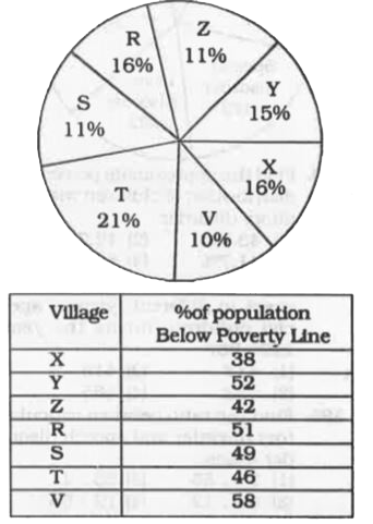
- The following pie chart shows proportion of population of seven villag...
Text Solution
|
- The following pie chart shows proportion of population of seven villag...
Text Solution
|
- The following pie chart shows proportion of population of seven villag...
Text Solution
|
- Directions : The Paichart shows Distribution of Spacial Childern Popul...
Text Solution
|
- The pie-chart shows Distribution of Special Children Population during...
Text Solution
|
- The pie-chart shows Distribution of Special Children Population during...
Text Solution
|
- Directions : The Paichart shows Distribution of Spacial Childern Popul...
Text Solution
|
- This is a pie-chart for the data on A, B, O, AB blood groups of 150 do...
Text Solution
|
- This is a pie-chart for the data on A, B, O, AB blood groups of 150 do...
Text Solution
|
- This is a pie-chart for the data on A, B, O, AB blood groups of 150 do...
Text Solution
|
- This is a pie-chart for the data on A, B, O, AB blood groups of 150 do...
Text Solution
|
- In the given pie-chart, the comaprative study of the production or Ric...
Text Solution
|
- In the given pie-chart, the comaprative study of the production or Ric...
Text Solution
|
- In the given pie-chart, the comaprative study of the production or Ric...
Text Solution
|
- The total production of rice, wheat, sugar and tea (in kgs) is 500000 ...
Text Solution
|
- Study the following pie-chart and answer the questions. The budge...
Text Solution
|
- Study the following pie-chart and answer the questions. Due to su...
Text Solution
|
- Study the following pie-chart and answer the questions. The diffe...
Text Solution
|
- Study the following pie-chart and answer the questions. The famil...
Text Solution
|
- The pie chart, given here shows monthly expenses on various heads and ...
Text Solution
|