A
B
C
D
Text Solution
Verified by Experts
The correct Answer is:


Topper's Solved these Questions
Similar Questions
Explore conceptually related problems
KIRAN PUBLICATION-STATISTICS AND DATA INTERPRETATION-TYPE-VII
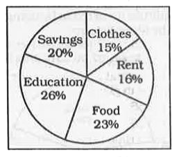
- The given pie-chart shows the breakup (in percentage) of monthly expen...
Text Solution
|
- The given pie-chart shows the breakup (in percentage) of monthly expen...
Text Solution
|
- The given pie-chart shows the breakup (in percentage) of monthly expen...
Text Solution
|
- The given pie-chart shows the breakup (in percentage) of monthly expen...
Text Solution
|
- The given pie-chart shows the breakup (in percentage) of monthly expen...
Text Solution
|
- The pie-chart given below shows the percentage of time taken by differ...
Text Solution
|
- The pie chart given below shows the percentage of time taken by differ...
Text Solution
|
- The pie chart given below shows the percentage of time taken by differ...
Text Solution
|
- The pie chart given below shows the percentage of time taken by differ...
Text Solution
|
- The pie-chart shows the annual car production (in millions) of six cou...
Text Solution
|
- The pie chart shows the annual car production of six countries (A,B,C...
Text Solution
|
- The pie-chart shows the annual car production (in millions) of six cou...
Text Solution
|
- The pie-chart shows the annual car production (in millions) of six cou...
Text Solution
|
- Students from different countries (A, B, C, D, E, F) participated in a...
Text Solution
|
- Students from different countries (A, B, C, D, E, F) participated in a...
Text Solution
|
- Students from different countries (A, B, C, D, E, F) participated in a...
Text Solution
|
- The pie-chart given below shows marks obtained by Aman in 5 subjects. ...
Text Solution
|
- The pie-chart given below shows marks obtained by Aman in 5 subjects. ...
Text Solution
|
- The pie-chart given below shows marks obtained by Aman in 5 subjects. ...
Text Solution
|
- The pie-chart given below shows marks obtained by Aman in 5 subjects. ...
Text Solution
|