A
B
C
D
Text Solution
Verified by Experts
The correct Answer is:


Topper's Solved these Questions
Similar Questions
Explore conceptually related problems
KIRAN PUBLICATION-STATISTICS AND DATA INTERPRETATION-TYPE-VII
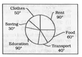
- The following pie chart shows the distribution of expenses (in degrees...
Text Solution
|
- The following pie chart shows the distribution of expenses (in degrees...
Text Solution
|
- The following pie chart shows the distribution of expenses (in degrees...
Text Solution
|
- The given pie chart shows the monthly expenditure on various items and...
Text Solution
|
- The given pie chart shows the monthly expenditure on various items and...
Text Solution
|
- The given pie chart shows the monthly expenditure on various items and...
Text Solution
|
- The given pie chart shows the monthly expenditure on various items and...
Text Solution
|
- The given pie chart shows the monthly expenditure on various items and...
Text Solution
|
- The given pie chart shows the distribution of expenditure of a company...
Text Solution
|
- The given pie chart shows the distribution of expenditure of a company...
Text Solution
|
- The given pie chart shows the distribution of expenditure of a company...
Text Solution
|
- The given pie chart shows the distribution of expenditure of a company...
Text Solution
|
- The pie-chart given below shows the number of students who like the fi...
Text Solution
|
- The pie-chart given below shows the number of students who like the fi...
Text Solution
|
- The pie-chart given below shows the number of students who like the fi...
Text Solution
|
- The pie-chart below shows percentage of money spent on different sport...
Text Solution
|
- The pie-chart below shows percentage of money spent on different sport...
Text Solution
|
- The pie-chart below shows percentage of money spent on different sport...
Text Solution
|
- The pie-chart below shows percentage of money spent on different sport...
Text Solution
|
- The pie chart shows the break up of expenditure of a trading company f...
Text Solution
|