A
B
C
D
Text Solution
Verified by Experts
The correct Answer is:


Topper's Solved these Questions
STATISTICS
MTG IIT JEE FOUNDATION|Exercise Exercise ( Subjective Problems ) (Very Short Answer Type )|10 VideosSTATISTICS
MTG IIT JEE FOUNDATION|Exercise Exercise ( Subjective Problems ) ( Short Answer Type )|10 VideosSTATISTICS
MTG IIT JEE FOUNDATION|Exercise Exercise (Assertion and Reason Type)|5 VideosQUADRILATERALS
MTG IIT JEE FOUNDATION|Exercise Olympiad/HOTS CORNER|15 VideosTRIANGLES
MTG IIT JEE FOUNDATION|Exercise OLYMPAID/ HOTS CORNER|10 Videos
Similar Questions
Explore conceptually related problems
MTG IIT JEE FOUNDATION-STATISTICS-Exercise (Comprehension Type)
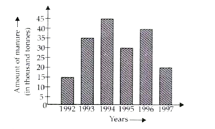
- The following graph gives the amount of manure (in thousand tonnes) ma...
Text Solution
|
- The following graph gives the amount of manure (in thousand tonnes) ma...
Text Solution
|
- The following graph gives the amount of manure (in thousand tonnes) ma...
Text Solution
|
- Durations of sunshine (in hours) in Amritsar for first 10 days of Augu...
Text Solution
|
- Durations of sunshine (in hours) in Amritsar for first 10 days of Augu...
Text Solution
|
- Durations of sunshine (in hours) in Amritsar for first 10 days of Augu...
Text Solution
|
- A, B, Care three sets of values of x: A: 2, 3, 7, 1, 3, 2, 3, B: 7, ...
Text Solution
|
- A, B, Care three sets of values of x: A: 2, 3, 7, 1, 3, 2, 3, B: 7, ...
Text Solution
|
- A, B, Care three sets of values of x: A: 2, 3, 7, 1, 3, 2, 3, B: 7, ...
Text Solution
|