


Topper's Solved these Questions
DATA HANDLING
MTG IIT JEE FOUNDATION|Exercise NCERT Section (Exercise 9.4)|4 VideosDATA HANDLING
MTG IIT JEE FOUNDATION|Exercise Exercise (Multiple Choice Questions) Level -1|35 VideosDATA HANDLING
MTG IIT JEE FOUNDATION|Exercise NCERT Section (Exercise 9.2)|5 VideosBASIC GEOMETRICAL IDEAS
MTG IIT JEE FOUNDATION|Exercise OLYMPIAD/HOTS CORNER|10 VideosDECIMALS
MTG IIT JEE FOUNDATION|Exercise OLYMPIAD/HOTS CORNER|20 Videos
Similar Questions
Explore conceptually related problems
MTG IIT JEE FOUNDATION-DATA HANDLING -NCERT Section (Exercise 9.3)
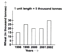
- The given bar graph shows the amount of wheat purchased by government ...
Text Solution
|
- The given bar graph shows the amount of wheat purchased by government ...
Text Solution
|
- Observe this bar graph which is showing the sale of shirts in a ready ...
Text Solution
|
- Observe this bar graph which is showing the sale of shirts in a ready ...
Text Solution
|
- Observe this bar graph which is showing the sale of shirts in a ready ...
Text Solution
|
- Observe this bar graph which is showing the sale of shirts in a ready ...
Text Solution
|
- Observe this bar graph which is showing the sale of shirts in a ready ...
Text Solution
|
- Observe this bar graph which shows the marks obtained by Aziz in half-...
Text Solution
|
- Observe this bar graph which shows the marks obtained by Aziz in half-...
Text Solution
|
- Observe this bar graph which shows the marks obtained by Aziz in half-...
Text Solution
|
- Observe this bar graph which shows the marks obtained by Aziz in half-...
Text Solution
|