A
B
C
D
Text Solution
Verified by Experts
The correct Answer is:


Similar Questions
Explore conceptually related problems
Recommended Questions
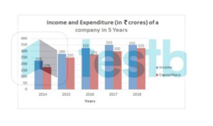
- The given Bar Graph presents Income and Expenditure (in crores of Rupe...
Text Solution
|
- the given bar graph presents income and Expenditure of a company for t...
Text Solution
|
- the given bar graph presents income and Expenditure of a company for t...
Text Solution
|
- The given bar graph presents the Revenue and Expenditure of a company ...
Text Solution
|
- The given bar graph (bar graph) shows the income and expenditure (in c...
Text Solution
|
- The given bar graph (bar graph) shows the revenue and expenditure (in ...
Text Solution
|
- Income and Expenditure of a Tire Company (Rs. in Crores) In which year...
Text Solution
|
- Income and Expenditure of a Tire Company (Rs. in Crores) What is the p...
Text Solution
|
- दिया गया दंड आरेख (बार ग्राफ ) पाँच वर्षों, 2014 से 2018 के दौरान किस...
Text Solution
|