A
B
C
D
Text Solution
Verified by Experts
The correct Answer is:


Similar Questions
Explore conceptually related problems
Recommended Questions
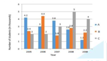
- The following graph below shows the number of students (in thousands) ...
Text Solution
|
- निम्नलिखित आकृति मे किसी कॉलेज में वर्ष 2000 से वर्ष 2004 तक प्रति वर्...
Text Solution
|
- निम्नलिखित आकृति मे किसी कॉलेज में वर्ष 2000 से वर्ष 2004 तक प्रति वर्...
Text Solution
|
- The inequation represented by the graph given below is : <img src="htt...
Text Solution
|
- The inequation that best describes the graph given below is <img src=...
Text Solution
|
- The following bar graph shows the number of students (in hundreds) who...
Text Solution
|
- The following bar graph shows the number of students admitted and pass...
Text Solution
|
- The following bar graph shows the number of students admitted and pass...
Text Solution
|
- The following bar graph shows the number of students admitted and pass...
Text Solution
|