Home
Class 14
MATHS
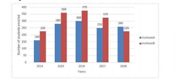
The given Bar Graph presents the number ...

The given Bar Graph presents the number of students enrolled for vocational course institutes A and B during a period of 5 years.

In which year the number of students enrolled in B is x% more, where `25 lt x lt 30`, then the number of students enrolled in A in the same year?

A

2015

B

2017

C

2016

D

2014

Text Solution

Verified by Experts

The correct Answer is:
A
Promotional Banner

Similar Questions

Explore conceptually related problems

Study the below table and answer the question. The number of students enrolled for a Vocational Course (VC) in Institutes A, B, C, D and E during 6 years The average number of students enrolled in VC in Institute C in six years is what percentage more than the number of students enrolled in Institute E in 2015 (correct to one decimal place)?

Study the below table and answer the question. The number of students enrolled for a Vocational Course (VC) in Institutes A, B, C, D and E during 6 years: The total number of students enrolled in VC in Institutes C,D and E in 2017 exceeds the total number of students enrolled in Institute B in 2015, 2017 and 2019 by x, where x lines between :

The given Bar graph presents the numbers of students from Science and Arts streams from a school in different years. In which year the number of Arts students is 30% more than that of Science?

Study the below table and answer the question. The number of students enrolled for a Vocational Course (VC) in Institutes A, B, C, D and E during 6 years: The total number of students enrolled in VC in Institute A in 2014, 2016 and 2017 is what percentage of the total number of students enrolled in VC in all the five institutes in 2019?

In the given bar graph, the number of students enrolled in institute B in the year 2016 is what percentage of students enrolled in institute A in 2016?

In the given bar graph, the number of students enrolled in institute b in the year 2016 is what percentage of students enrolled in institute A in 2016?