A
B
C
D
Text Solution
Verified by Experts
The correct Answer is:


Similar Questions
Explore conceptually related problems
Recommended Questions
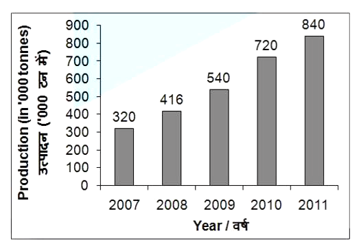
- The bar graph given below shows the production (in000 tonnes) of rice...
Text Solution
|
- The cost of living index for the year 2007 considering the base year a...
Text Solution
|
- Find the cost of living index in the year 2007, taking 2001 as the bas...
Text Solution
|
- The cost of living index for the year 2007, considering the year 2000...
Text Solution
|
- Determine the point of symmetry of a regular hexagon. <img src="htt...
Text Solution
|
- Match the following Column A to Column B
Text Solution
|
- Match the following Column A to Column B
Text Solution
|
- Match the following Column A to Column B
Text Solution
|
- Find the area of figure given below.
Text Solution
|