Home
Class 9
MATHS
Given below is a table which shows the y...

Given below is a table which shows the year wise strenght of a school. Represent this data by a bar graph

Promotional Banner

Topper's Solved these Questions

  • STATISTICS

    MODERN PUBLICATION|Exercise EXERCISE|239 Videos
  • QUADRILATERALS

    MODERN PUBLICATION|Exercise EXERCISE|133 Videos
  • SURFACE AREAS AND VOLUMES

    MODERN PUBLICATION|Exercise EXERCISE|228 Videos

Similar Questions

Explore conceptually related problems

The following table shows the favourite sports of 250 students of a school. Represent the data by a bar graph

The birth rate per thousand in five countries over a priod of time is shown below Represent the above data by a bar graph.

Following data gives total marks (out of 600) obtained by six students of a particular class. Represent the data on a bar graph.

Two hundred students of 6th and 7th classes were asked to name their favourite colour so as to decide upon what should be the colour of their school building. The results are shown in the following table. Represent the given data on a bar graph. Answer the following questions with the help of the bar graph: Which is the most preferred colour and which is the least preferred?

Two hundred students of 6th and 7th classes were asked to name their favourite colour so as to decide upon what should be the colour of their school building. The results are shown in the following table. Represent the given data on a bar graph. Answer the following questions with the help of the bar graph: How many colours are there in all? What are they?

Following data gives total marks (out of 600) obtained by six children of a particular class. Represent the data on a bar graph.

The following table gives the number of students in IX class in a school during the academic years 2012-2013 to 2016-17 Represent the above data by a bar graph.

The following data on the number of girls to the nearest ton per thousand boys in different sections of the society is given below: (i) Represent the information above by a bar graph. (ii) Write two conclusions you can arrive at from the graph, with justification.

The following table shows the number of students in various classes in different school activities. Represent the above data by a pie chart.

MODERN PUBLICATION-STATISTICS-EXERCISE
  1. One a certain day the temperatuer in a city was recorded as under: Il...

    Text Solution

    |

  2. The following table shows the favourite sports of 250 students of a sc...

    Text Solution

    |

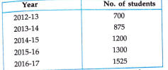
  3. Given below is a table which shows the year wise strenght of a school....

    Text Solution

    |

  4. The birth rate per thousand in five countries over a priod of time is ...

    Text Solution

    |

  5. The air distance of four cities form Delhi are given below Draw a gra...

    Text Solution

    |

  6. Gold prices on 4 consecutive wednesdays were as under: Draw a bar gra...

    Text Solution

    |

  7. Various modes of transport used by 1950 students of a school are given...

    Text Solution

    |

  8. The following table shows the daily production of T.V sets in a indust...

    Text Solution

    |

  9. Read the bar graph shown in fig. and answer the following questions W...

    Text Solution

    |

  10. Read the bar graph shown in fig. and answer the following questions H...

    Text Solution

    |

  11. Read the bar graph shown in fig. and answer the following questions O...

    Text Solution

    |

  12. Read the bar graph shown in fig. and answer the following questions T...

    Text Solution

    |

  13. Read the bar graph shown in fig. and answer the following questions O...

    Text Solution

    |

  14. Read the bar graph shown in fig. and answer the following questions W...

    Text Solution

    |

  15. Read the bar graph shown in fig. and answer the following questions W...

    Text Solution

    |

  16. Read the bar graph shown in fig. and answer the following questions W...

    Text Solution

    |

  17. Read the bar graph shown in fig. and answer the following questions T...

    Text Solution

    |

  18. What is the information given y the bar graph

    Text Solution

    |

  19. The number of governement companies in 1996 is that of 2011 of 1:9

    Text Solution

    |

  20. The number of government companies have decreased over the year 1998 t...

    Text Solution

    |