Home
Class 14
MATHS
The Table given below presents the Rainf...

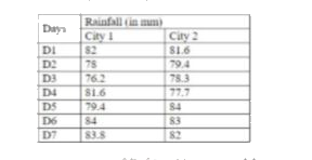
The Table given below presents the Rainfall (in mm) in two cities on different days of a week.

If the data of Rainfall of city 1 is represented through a Pie chart, then what will be the central angle (nearest to 0.1 degree) corresponding to D1?

A

`53.3`

B

`51.9`

C

`52.2`

D

`50.8`

Text Solution

Verified by Experts

The correct Answer is:
C
Promotional Banner

Similar Questions

Explore conceptually related problems

The Table given below presents the Rainfall (in mm) in two cities on different of a week. The rainfall on day D2 in city 1 is how much percent more than the rainfall on day D4 in City 2?

The Table given below presents the Rainfall (in mm) in two cities on different days of a week. What is the difference (correct up to two decimal places) in average rainfall in two cities per day?

The Table given below presents the Rainfall (in mm) in two cities on different days of a week. नीचे दी गयी तालिका दो शहरों में सप्ताह के अलग-अलग दिन हुई बारिश (मिमी में ) को दर्शाती है | If the data of Rainfall of City 1 is represented through a Pie chart, then what will be the central angle (nearest to 0.1 degree) corresponding to D1? यदि शहर 1 की वर्षा के आंकड़ों को एक पाई-चार्ट में प्रस्तुत किया जाए, तो D1 के संगत केंद्रीय कोण ( 0.1 डिग्री के निकटतम ) का मान क्या होगा ?

The Table given below presents the Rainfall (in mm) in two cities on different days of a week. नीचे दी गयी तालिका दो शहरों में सप्ताह के अलग-अलग दिन हुई बारिश (मिमी में ) को दर्शाती है | What is the difference (correct up to two decimal places) in average rainfall in two cities per day? प्रति दिन इन दो शहरों में होने वाली औसत वर्षा में क्या अंतर ( दशमलव के दो स्थान तक) है ?

In a test in Mathematics, 20% of the students obtained ''first class''. If the data are represented by a Pie - chart, what is the central angle corresponding to ''first class''?

The table shows the production of different types of cars ( in thousands). If the data related to the production of type B cars is represented by a pie chart, then the central angle for the sector representing the production of cars in 2016 is :

The Bar graph given below presents the number of female employees working in two factories on six different days of a week. What is the difference (correct up to two decimal places) in the average number of females working per day in a factory F1 and the average number of females working per day in a factory F2?