A
B
C
D
Text Solution
Verified by Experts
The correct Answer is:


Topper's Solved these Questions
Similar Questions
Explore conceptually related problems
UPKAR PUBLICATION -DATA ANALYSIS-QUESTION BANK
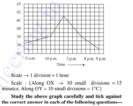
- The following graph shows the temperature of a patient observed in a h...
Text Solution
|
- The following graph shows the temperature of a patient observed in a h...
Text Solution
|
- The following graph shows the temperature of a patient observed in a h...
Text Solution
|
- The following graph shows the temperature of a patient observed in a h...
Text Solution
|
- The following graph shows the annual premium of an insurance company. ...
Text Solution
|
- The following graph shows the annual premium of an insurance company. ...
Text Solution
|
- The following graph shows the annual premium of an insurance company. ...
Text Solution
|
- The following graph shows the annual premium of an insurance company. ...
Text Solution
|
- The following graph shows the annual premium of an insurance company. ...
Text Solution
|
- The following graph shows the annual premium of an insurance company. ...
Text Solution
|
- Study the following graphs carefully and answer the questions that fol...
Text Solution
|
- Study the following graphs carefully and answer the questions that fol...
Text Solution
|
- To show the distribution of proteins and other dry elements in the ...
Text Solution
|
- Study the following graphs carefully and answer the questions that fol...
Text Solution
|
- Study the following graphs carefully and answer the questions that fol...
Text Solution
|
- Circle graph given above shows the expenditure incurred in bringing ou...
Text Solution
|
- Circle graph given above shows the expenditure incurred in bringing ou...
Text Solution
|
- Circle graph given above shows the expenditure incurred in bringing ou...
Text Solution
|
- Circle graph given above shows the expenditure incurred in bringing ou...
Text Solution
|
- Circle graph given above shows the expenditure incurred in bringing ou...
Text Solution
|