A
B
C
D
Text Solution
Verified by Experts
The correct Answer is:


Topper's Solved these Questions
Similar Questions
Explore conceptually related problems
GAGAN PRATAP -DATA INTERPRETATION (DI)-MULTIPLE CHOICE QUESTION
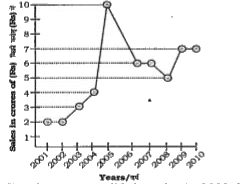
- The following line diagram represents the yearly sales figure of a com...
Text Solution
|
- The following line diagram represents the yearly sales figure of a com...
Text Solution
|
- The following line diagram represents the yearly sales figure of a com...
Text Solution
|
- The following line diagram represents the yearly sales figure of a com...
Text Solution
|
- The following line diagram represents the yearly sales figure of a com...
Text Solution
|
- The following graph shows production (in thousands) of two types (P an...
Text Solution
|
- The following graph shows production (in thousands) of two types (P an...
Text Solution
|
- The following graph shows production (in thousands) of two types (P an...
Text Solution
|
- The following graph shows production (in thousands) of two types (P an...
Text Solution
|
- The following graph shows production (in thousands) of two types (P an...
Text Solution
|
- Read the following pie-charts carefully to answer the questions. ...
Text Solution
|
- Study the following pie-charts carefully and answer the questions. ...
Text Solution
|
- Read the following pie-charts carefully to answer the questions. ...
Text Solution
|
- Read the following pie-charts carefully to answer the questions. ...
Text Solution
|
- Read the following pie-charts carefully to answer the questions. ...
Text Solution
|
- The following bar-diagram shows total number of males and females in f...
Text Solution
|
- The following bar-diagram shows total number of males and females in f...
Text Solution
|
- The following bar-diagram shows total number of males and females in f...
Text Solution
|
- The following bar-diagram shows total number of males and females in f...
Text Solution
|
- The following bar-diagram shows total number of males and females in f...
Text Solution
|