A
B
C
D
Text Solution
Verified by Experts
The correct Answer is:


Similar Questions
Explore conceptually related problems
Recommended Questions
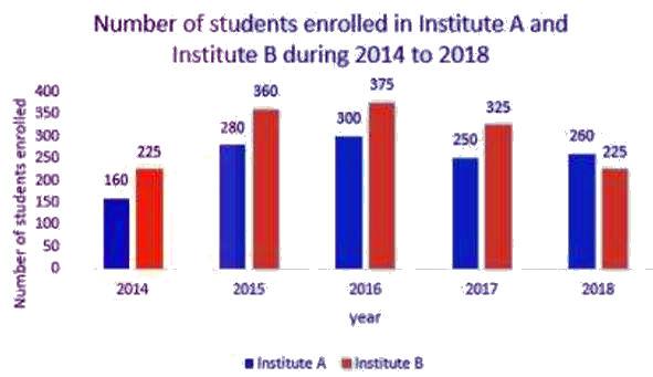
- Study the following bar graph that shows the number of students enroll...
Text Solution
|
- The given bar graph presents the number of students enrolled for a voc...
Text Solution
|
- The given Bar Graph presents the number of students enrolled for a voc...
Text Solution
|
- What is the ratio of the total numbers of students enrolled in A durin...
Text Solution
|
- In the given bar graph, the number of students enrolled in institute b...
Text Solution
|
- The given bar graph shows the number of students enrolled for vocation...
Text Solution
|
- What is the ratio of the total number of students enrolled in institut...
Text Solution
|
- दिया गया दंड आरेख (बार ग्राफ ) पाँच वर्ष की अवधि के दौरान संस्थान A और...
Text Solution
|
- दिया गया दंड आरेख (बार ग्राफ ) पाँच वर्ष की अवधि के दौरान संस्थान A और...
Text Solution
|