A
B
C
D
Text Solution
Verified by Experts
The correct Answer is:


Topper's Solved these Questions
IMO QUESTION PAPER 2018 SET A
SCIENCE OLYMPIAD FOUNDATION |Exercise EVERYDAY MATHEMATICS|10 VideosIMO QUESTION PAPER 2018 SET A
SCIENCE OLYMPIAD FOUNDATION |Exercise ACHIEVERS SECTION|5 VideosIMO QUESTION PAPER 2017 SET B
SCIENCE OLYMPIAD FOUNDATION |Exercise ACHIEVERS SECTION|5 VideosIMO QUESTION PAPER 2018 SET B
SCIENCE OLYMPIAD FOUNDATION |Exercise Achievers Section |5 Videos
Similar Questions
Explore conceptually related problems
SCIENCE OLYMPIAD FOUNDATION -IMO QUESTION PAPER 2018 SET A-ACHIEVERS SECTION
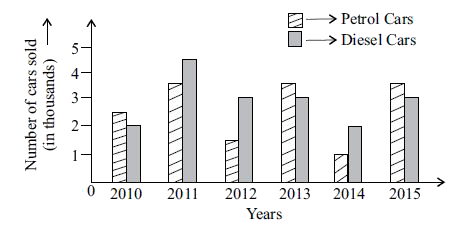
- Direction : The given bar graph represents the petrol and diesel cars ...
Text Solution
|
- Read the statements carefully and select the correct option. Stateme...
Text Solution
|
- ABC is a triangle. D is a point on AB such that AD = (1)/(4) AB and E ...
Text Solution
|
- Study the given co-ordinate system carefully. Which of the following o...
Text Solution
|
- Match the following:
Text Solution
|
- A die having numbers 1, 2, 4, 6, 7 and 8 on its faces, is rolled once....
Text Solution
|