Text Solution
Verified by Experts
The correct Answer is:


Topper's Solved these Questions
Similar Questions
Explore conceptually related problems
SCIENCE OLYMPIAD FOUNDATION -POLLUTION OF AIR AND WATER -ACHIEVERS SECTION (HOTS)
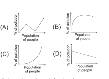
- Which of the following graphs shows the likely relationship between th...
Text Solution
|
- An oil spill covered a large area of water in an ocean. The marine lif...
Text Solution
|
- Following are the steps of purification of water. (i) Water collect...
Text Solution
|
- The events which occur in the water body after it has been polluted by...
Text Solution
|
- As proved by many studies greenhouse effect is rapidly increasing beca...
Text Solution
|
- Which of the following are possible advantages of using bacteria in se...
Text Solution
|