
Text Solution
Verified by Experts


Topper's Solved these Questions
STATISTICS
NAVNEET PUBLICATION - MAHARASHTRA BOARD|Exercise PRACTICE SET 6.1|6 VideosSTATISTICS
NAVNEET PUBLICATION - MAHARASHTRA BOARD|Exercise PRACTICE SET 6.2|4 VideosSTATISTICS
NAVNEET PUBLICATION - MAHARASHTRA BOARD|Exercise EXAMPLES|3 VideosSIMILARITY
NAVNEET PUBLICATION - MAHARASHTRA BOARD|Exercise SUBJECTIVE TYPE|20 VideosTHEOREMS
NAVNEET PUBLICATION - MAHARASHTRA BOARD|Exercise CIRCLE|15 Videos
Similar Questions
Explore conceptually related problems
NAVNEET PUBLICATION - MAHARASHTRA BOARD-STATISTICS-MISCELLANEOUS
- Find the correct answer from the alternative given : The median ...
Text Solution
|
- Find the correct answer from the alternative given : The above d...
Text Solution
|
- The following table shows the income of farmers in a grape season. Fin...
Text Solution
|
- The loans sanctioned by a bank for construction of farm ponds are show...
Text Solution
|
- The weekly wages of 120 workers in a factory are shown in the followi...
Text Solution
|
- The following frequency distribution table shows the amount of aid giv...
Text Solution
|
- The distances covered by 250 pubic transport buses in a day is shown i...
Text Solution
|
- The prices of different articles and demand for them is shown in the ...
Text Solution
|
- The following frequency table shows the demand for a sweet and the num...
Text Solution
|
- Draw a histogram for the following frequency distribution.
Text Solution
|
- In a handloom factory, different workers take different periods of tim...
Text Solution
|
- The time required for students to do a science experiment and the numb...
Text Solution
|
- Draw a frequency polygon for the following grouped frequency distribut...
Text Solution
|
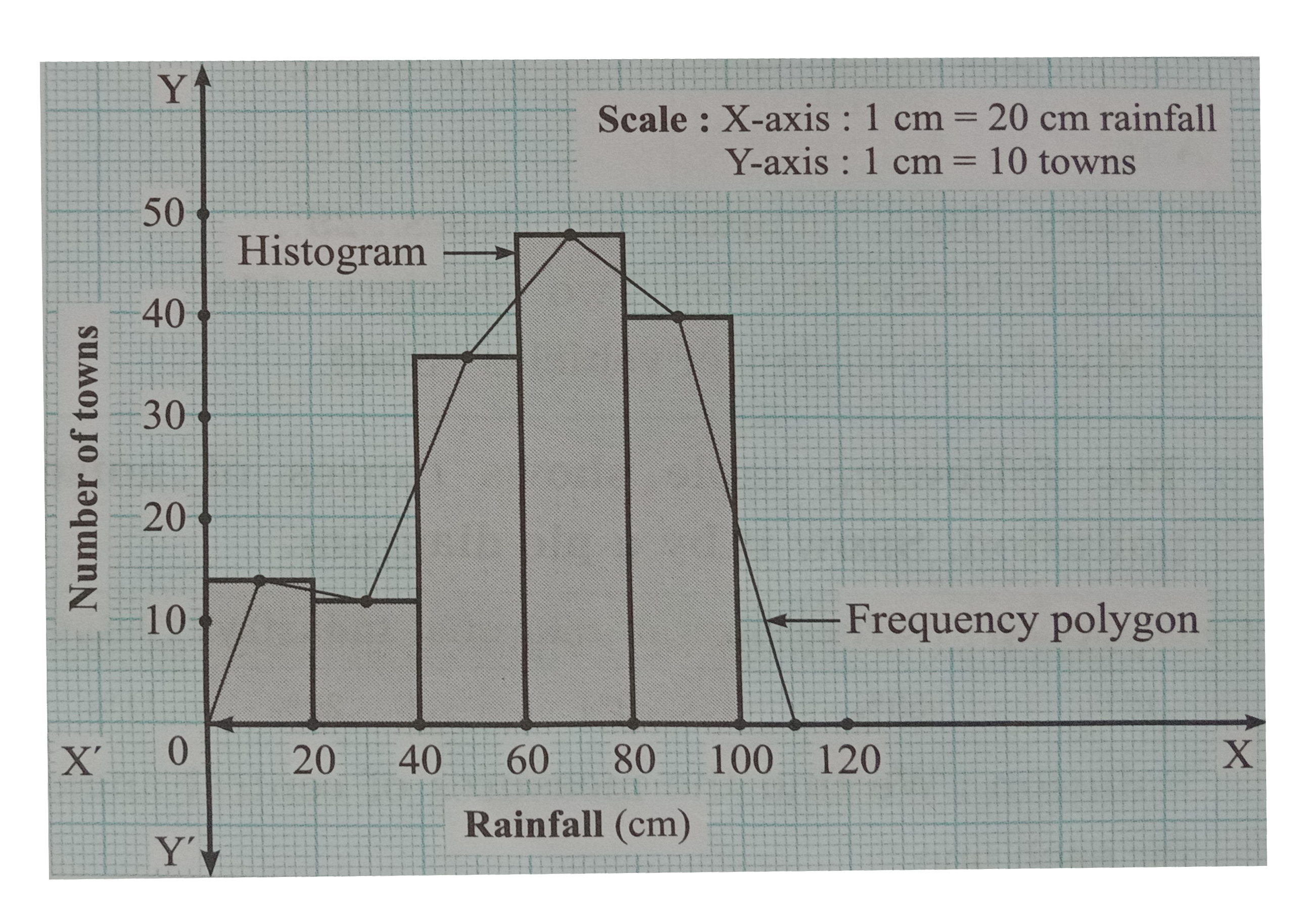
- The following table shows the average rainfall in 150 towns. Towns. Sh...
Text Solution
|
- Observe the pie diagram given below .It shows the percentages of numbe...
Text Solution
|
- Observe the pie diagram given below .It shows the percentages of numbe...
Text Solution
|
- The following table shows causes of noise pollution. Show it by a pie ...
Text Solution
|
- A survey of students was made to know which game they like. The data o...
Text Solution
|
- Medical checkup of 180 women was conducted in a health centre in a vil...
Text Solution
|
- On an environment day, students in a school planted 120 trees under pl...
Text Solution
|