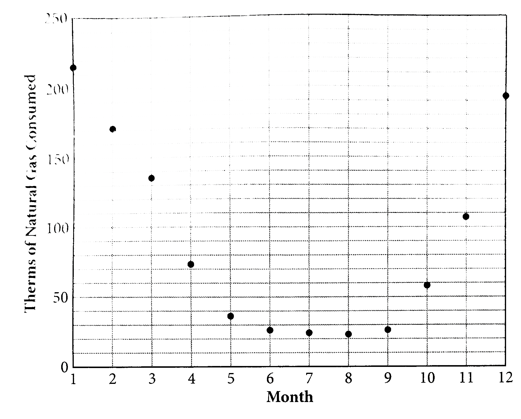
The scatterplot above shows the avrage therms of naturela gas used by residential constomeers over a 12-month period. Of the following equations, which best models the data in the scatterplot ?
A
`y =1.061^(x)+ 312.9`
B
`y=-1.061^(x)-312.9`
C
`y=6.1x ^(2)-85.1x+312.9`
D
`y =- 6.1 x ^(21) + 85. 1 x - 312.9`
Text Solution
Verified by Experts
The correct Answer is:
C
The data in the scatterplot can be modeled by a parabola opening upwars. (A) is an exponential growth equation, and (B) is an exponential decay equation. Neither will graph as a parabola, so eliminate both. Recall that a parabola is the graph of a quadratic. For a quadratic equation in the form `ax ^(2) +bx+c,a` determines whether the parabola opens upward of downward and c is teh y-intercept. When `a gt 0,` the parabola opens upward, so (C ) is correct. (D) is a quadratic equation, but `a lt 0,` so this equation would graph as a parabola that opens downeard.
Topper's Solved these Questions
SCATTERPLOTS
KAPLAN|Exercise TRY ON YOUR OWN|20 Videos
SCATTERPLOTS
KAPLAN|Exercise LINE OF BEST FIT|1 Videos
SAT MATH: TIMING ANS SECTION MANAGEMENT STRATEGIES
KAPLAN|Exercise TRY ON YOU OWN|5 Videos
SYSTEMS OF LINEAR EQUATIONS
KAPLAN|Exercise NUMBER OF POSSIBLE SOLUTIONS|1 Videos
Similar Questions
Explore conceptually related problems
Which of the following equations best models the data shown in the scatterplot above?
The scatterplot below shows the amount of electric energy generated, in millions of megawatt-hours, by nuclear sources over a 10‑year period. Of the following equations, which best models the data in the scatterplot?
The scatterplot below compares the average gasoline prices I Boston, per gallon, to the average gasoline prices across the United States, per gallon, during a one-year period from 2017 to 2018. Of the following equations, whihc best modeles the data in the scatterplot ?
A drain at the bottom of a cylondrical water tank is opened and the height of the water is measured at regular time intervals. The tank is refilled and the process is then repeated. The scatterplot above shows the measured height on the y-axis and time on the x-axis for the trials. Which of the following conclusions can be drawn from the observations in the scatterplot?
For which of the following values of a and b does the equation y = ax ^(b) model the data in the scatterplot above ?
Which of the following best describes the type of association shown in the scatterplot above?
Which of the following is most likely the slope of the line of best fit for the scatterplot above?
Given that a,b, and c are constants and that a gt 0, which of the following is the equation for the line of best fit for the above scatterplot ?
The scatterplot above shows the weight, in ounces,of the fruits on a certain truffula tree from days 55 to 85 after flowering. According to the line of best fit in the scatterplot above, which of the following is the closest approximation of the number of days after flowering of a truffula fruit that weighs 5.75 ounces?
Which of the following equation corresponds to the line of best fit for the data set shown above ?