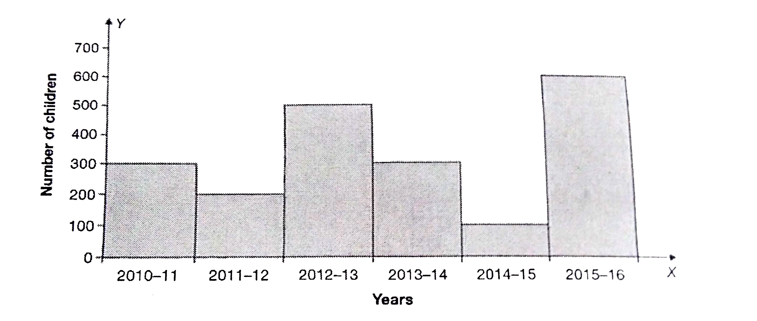
The graph given below shows the number of enrolments of nursery children over a period of 6 years. Study the graph carefully answer the following questions. (i) In which year was the enrolment of children highest ? (ii) In which two years was enrolment of children equal ? (iii) What was the increase in the number of children between 2013-14 and 2015-16
Text Solution
Verified by Experts
(i) In the year 2015-16. (ii) In the years 2010-11 and 2013-14. (iii) the increase in the number of children between 2013-14 and 2015-16=6000-300=300.
Topper's Solved these Questions
STATISTICS
PEARSON IIT JEE FOUNDATION|Exercise EXAMPLE 10.4|1 Videos
STATISTICS
PEARSON IIT JEE FOUNDATION|Exercise EXAMPLE 10.5|1 Videos
STATISTICS
PEARSON IIT JEE FOUNDATION|Exercise EXAMPLE 10.2|1 Videos
Study the given graph carefully and answer the following questions. What fraction of the total number of children plays football ?
Read the following graph carefully and answer the questions given below: In which two years the number of girls is equal ?
The bar graph given here shows the number of jobseekers of a state in various years at different stages of education. Study the graph carefully and answer the question based on it. In which year, was the number of Matriculate job-seekers maximum ?
Study the following graph carefully and answer the questions that What was the average of percent rise over the given years ?
Following graph shows the income of a company in six different years. Study the graph , carefully and answer the questions that follow. In which year income of the company is the highest?
Study the given graph carefully and answer the following questions. The difference between the number of children who pay tennis and cricket together & basketball and volleyball together is
The line graph shows the number of students of a certain university who failed in the given year in their final exams. Study the diagram and answer the following questions What was the difference in failures between the years 2011 and 2013?