Home
Class 14
MATHS
Study the bar graph showing the producti...


Study the bar graph showing the production of food grains (in million tons).
What is the ratio between the maximum production and the minimum production during the given period ?

A

`1:2`

B

`2:3`

C

`3:4`

D

`5:2`

Text Solution

Verified by Experts

The correct Answer is:
D
Promotional Banner

Topper's Solved these Questions

  • STATISTICS AND DATA INTERPRETATION

    KIRAN PUBLICATION|Exercise TYPE-III|39 Videos
  • STATISTICS AND DATA INTERPRETATION

    KIRAN PUBLICATION|Exercise TYPE-IV|182 Videos
  • STATISTICS AND DATA INTERPRETATION

    KIRAN PUBLICATION|Exercise TYPE-VIII|8 Videos
  • SIMPLIFICATION

    KIRAN PUBLICATION|Exercise TEST YOURSELF|25 Videos
  • TIME AND DISTANCE

    KIRAN PUBLICATION|Exercise Type -XI|74 Videos

Similar Questions

Explore conceptually related problems

Study the above bar graph showing the production of food grains (in million tons). What is the ratio between the maximum production and the minimum production during the given period ?

Read the bar graph given below Read the bar graph carefully and answer the following questions Q(i) What information is given by the bar graph (ii) In which year was the production maximum (iii) After which year was there a sudden fall in the production (iv) Find the ratio between the maximum production and the minimum production during the given period

The bar chart shows the annual food grain production (in million tonnes) for years 2012-2017. For how many years is the production less than the average production during the given period? यह दंड आरेख वर्ष 2012-2017 की अवधि में वार्षिक खाद्यान्न उत्पादन (मिलियन टन में ) को दर्शाता है | कितने वर्ष उत्पादन इस अवधि के औसत उत्पादन से कम है ?

The following table shows the productions of food-grains (in million tons) in a state for the period 1999-2000 to 2003-2004. Read the table and answer the questions During the period 1999-2000 to 2003-2004, x percent of the total production is production of wheat. The value of x is about

Direction :- The following table shows the production of food grains (in million tonnes) in a state for the period 1988 to 1992. Read the table and answer the following questions. During 1990, the percentage of decrease in production of maize as against the previous year was

Study the table graph carefully to answer the questions that follows Production of main crops in India (in million tonnes) What was the average production of rice in the given years?

Read the bar graph given below and answer the following questions. What is the ratio of the production of foodgrains in 2011 to that in 2014?

Direction :- The following table shows the production of food grains (in million tonnes) in a state for the period 1988 to 1992. Read the table and answer the following questions.

KIRAN PUBLICATION-STATISTICS AND DATA INTERPRETATION-TYPE-II
  1. The above bar graph show the marks obtained by a students in an examin...

    Text Solution

    |

  2. Study the bar graph carefully and answer the following question. Whi...

    Text Solution

    |

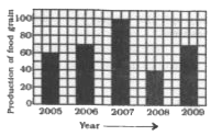
  3. Study the bar graph showing the production of food grains (in million ...

    Text Solution

    |

  4. The distribtution of fruit consumption in a sample of 72 seventeen - y...

    Text Solution

    |

  5. The distribtution of fruit consumption in a sample of 72 seventeen - y...

    Text Solution

    |

  6. The distribtution of fruit consumption in a sample of 72 seventeen - y...

    Text Solution

    |

  7. The bar-graph given below shows the percentage distribution of total e...

    Text Solution

    |

  8. The bar-graph given below shows the percentage distribution of total e...

    Text Solution

    |

  9. The bar-graph given below shows the percentage distribution of total e...

    Text Solution

    |

  10. The bar-graph given below shows the percentage distribution of total e...

    Text Solution

    |

  11. The bar graph shows the percentage distribution of the total expenditu...

    Text Solution

    |

  12. The bar graph shows the percentage distribution of the total expenditu...

    Text Solution

    |

  13. The bar graph shows the percentage distribution of the total expenditu...

    Text Solution

    |

  14. The bar graph shows the percentage distribution of the total expenditu...

    Text Solution

    |

  15. The bar graph shows the percentage distribution of the total expenditu...

    Text Solution

    |

  16. The following table shows the worldwide production of steel in 1920-19...

    Text Solution

    |

  17. The following table shows the worldwide production of steel in 1920-19...

    Text Solution

    |

  18. The following table shows the worldwide production of steel in 1920-19...

    Text Solution

    |

  19. The following table shows the worldwide production of steel in 1920-19...

    Text Solution

    |

  20. The graph shows the production of food grains of a country in differen...

    Text Solution

    |