A
B
C
D
Text Solution
Verified by Experts
The correct Answer is:


Topper's Solved these Questions
STATISTICS AND DATA INTERPRETATION
KIRAN PUBLICATION|Exercise TYPE-III|39 VideosSTATISTICS AND DATA INTERPRETATION
KIRAN PUBLICATION|Exercise TYPE-IV|182 VideosSTATISTICS AND DATA INTERPRETATION
KIRAN PUBLICATION|Exercise TYPE-VIII|8 VideosSIMPLIFICATION
KIRAN PUBLICATION|Exercise TEST YOURSELF|25 VideosTIME AND DISTANCE
KIRAN PUBLICATION|Exercise Type -XI|74 Videos
Similar Questions
Explore conceptually related problems
KIRAN PUBLICATION-STATISTICS AND DATA INTERPRETATION-TYPE-II
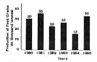
- The graph shows the production of food grains of a country in differen...
Text Solution
|
- The graph shows the production of food grains of a country in differen...
Text Solution
|
- The graph shows the production of food grains of a country in differen...
Text Solution
|
- Following table gives about the percentage change of the population in...
Text Solution
|
- Following table givesd about the percentage change of the population i...
Text Solution
|
- Following table givesd about the percentage change of the population i...
Text Solution
|
- Following table givesd about the percentage change of the population i...
Text Solution
|
- Study the following bar-diaggram carefully and answer the questions. T...
Text Solution
|
- Study the following bar-diaggram carefully and answer the questions. T...
Text Solution
|
- Study the following bar-diaggram carefully and answer the questions. T...
Text Solution
|
- Study the following bar-diaggram carefully and answer the questions. T...
Text Solution
|
- The bar-chart is showing the number of accidents in a city during the ...
Text Solution
|
- The bar-chart is showing the number of accidents in a city during the ...
Text Solution
|
- The bar-chart is showing the number of accidents in a city during the ...
Text Solution
|
- The bar-chart is showing the number of accidents in a city during the ...
Text Solution
|
- The bar diagram shows the monthly expenditure of a company. Study the ...
Text Solution
|
- The bar diagram shows the monthly expenditure of a company. Study the ...
Text Solution
|
- The bar diagram shows the monthly expenditure of a company. Study the ...
Text Solution
|
- The bar diagram shows the monthly expenditure of a company. Study the ...
Text Solution
|
- Study the bar diagram and answer the following questions. The bar di...
Text Solution
|