A
B
C
D
Text Solution
Verified by Experts
The correct Answer is:


Topper's Solved these Questions
STATISTICS AND DATA INTERPRETATION
KIRAN PUBLICATION|Exercise TYPE-V|38 VideosSTATISTICS AND DATA INTERPRETATION
KIRAN PUBLICATION|Exercise TYPE-VI|86 VideosSTATISTICS AND DATA INTERPRETATION
KIRAN PUBLICATION|Exercise TYPE-III|39 VideosSIMPLIFICATION
KIRAN PUBLICATION|Exercise TEST YOURSELF|25 VideosTIME AND DISTANCE
KIRAN PUBLICATION|Exercise Type -XI|74 Videos
Similar Questions
Explore conceptually related problems
KIRAN PUBLICATION-STATISTICS AND DATA INTERPRETATION-TYPE-IV
- The following questions are based on the bar graph. Read the graph and...
Text Solution
|
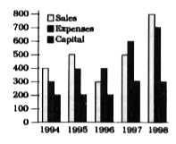
- The following graph gives Sales, Expenses and Capital of a company for...
Text Solution
|
- The following graph gives Sales, Expenses and Capital of a company for...
Text Solution
|
- The following graph gives Sales, Expenses and Capital of a company for...
Text Solution
|
- The following graph gives Sales, Expenses and Capital of a company for...
Text Solution
|
- The following graph gives Sales, Expenses and Capital of a company for...
Text Solution
|
- Given here is a multiple bar diagram depicting the changes in the stud...
Text Solution
|
- Given here is a multiple bar diagram depicting the changes in the stud...
Text Solution
|
- Given here is a multiple bar diagram depicting the changes in the stud...
Text Solution
|
- Given here is a multiple bar diagram depicting the changes in the stud...
Text Solution
|
- The following graph shows the production of cotton bales of 100 kg eac...
Text Solution
|
- The following graph shows the production of cotton bales of 100 kg eac...
Text Solution
|
- The following graph shows the production of cotton bales of 100 kg eac...
Text Solution
|
- The following graph shows the production of cotton bales of 100 kg eac...
Text Solution
|
- The following graph shows the production of wheat flour (in 1000 tonne...
Text Solution
|
- The following graph shows the production of wheat flour (in 1000 tonne...
Text Solution
|
- The following graph shows the production of wheat flour (in 1000 tonne...
Text Solution
|
- The following graph shows the production of wheat flour (in 1000 tonne...
Text Solution
|
- The bar graph, given here, shows the diamond and production of colour ...
Text Solution
|
- The bar graph, given here, shows the diamond and production of colour ...
Text Solution
|