Home
Class 14
MATHS
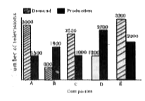
The bar graph, given here, shows the dia...

The bar graph, given here, shows the diamond and production of colour televisions of five companies for Diwali season in the year 2009. Study the graph carefully and answer the questions based on the graph.

The production of colour televisions of company D is how many times that of company A ?

A

1.9

B

1.8

C

1.5

D

2.3

Text Solution

Verified by Experts

The correct Answer is:
B
Promotional Banner

Topper's Solved these Questions

  • STATISTICS AND DATA INTERPRETATION

    KIRAN PUBLICATION|Exercise TYPE-V|38 Videos
  • STATISTICS AND DATA INTERPRETATION

    KIRAN PUBLICATION|Exercise TYPE-VI|86 Videos
  • STATISTICS AND DATA INTERPRETATION

    KIRAN PUBLICATION|Exercise TYPE-III|39 Videos
  • SIMPLIFICATION

    KIRAN PUBLICATION|Exercise TEST YOURSELF|25 Videos
  • TIME AND DISTANCE

    KIRAN PUBLICATION|Exercise Type -XI|74 Videos

Similar Questions

Explore conceptually related problems

The bar graph, given here, shows the diamond and production of colour televisions of five companies for Diwali season in the year 2009. Study the graph carefully and answer the questions based on the graph. The ratio of the demand and production of colour televisions of company E is :

The bar graph, given here, shows the diamond and production of colour televisions of five companies for Diwali season in the year 2009. Study the graph carefully and answer the questions based on the graph. The demand of colour televisions of company B is approximately what per cent of that of company C ?

Study the given bar graph carefully and answer the questions based on it. Production (in lakh tonne) of wheat from 2005-10 What is the mean production for all the years?

The following graph shows the production of wheat flour (in 1000 tonnes) by three companies X, Y and Z over the years. Study the graph and answer the questions. What is the percentage Increase in the production of company Y from 2002 to 2003?

The following graph shows the demand and production of cotton by 5 companies A, B, C, D and E. Study the graph and answer question The production of company D is how many times that of the production of the company A?

The following graph shows the production of wheat flour (in 1000 tonnes) by three companies X, Y and Z over the years. Study the graph and answer the questions. The average production for five years was maximum for which company ?

Following graph shows the income of a company in six different years. Study the graph , carefully and answer the questions that follow. What is the ratio of the income of the company in the years 2000 and 2005 ?

KIRAN PUBLICATION-STATISTICS AND DATA INTERPRETATION-TYPE-IV
  1. The bar graph, given here, shows the diamond and production of colour ...

    Text Solution

    |

  2. The bar graph, given here, shows the diamond and production of colour ...

    Text Solution

    |

  3. The bar graph, given here, shows the diamond and production of colour ...

    Text Solution

    |

  4. The bar graph, given here, shows the demand and production of colour t...

    Text Solution

    |

  5. Read the graph and answer the following questions. What is the di...

    Text Solution

    |

  6. Read the graph and answer the following questions. The number of ...

    Text Solution

    |

  7. Read the graph and answer the following questions. The ratio of t...

    Text Solution

    |

  8. Read the graph and answer the following questions. Percentage inc...

    Text Solution

    |

  9. Read the graph and answer the following questions. The total inco...

    Text Solution

    |

  10. The bar diagram given below shows the productions (in the unit of thou...

    Text Solution

    |

  11. The bar diagram given below shows the productions (in the unit of thou...

    Text Solution

    |

  12. The bar diagram given below shows the productions (in the unit of thou...

    Text Solution

    |

  13. The bar diagram given below shows the productions (in the unit of thou...

    Text Solution

    |

  14. The bar diagram given below shows the productions (in the unit of thou...

    Text Solution

    |

  15. The following bar-diagram shows total number of males and females in f...

    Text Solution

    |

  16. The following bar-diagram shows total number of males and females in f...

    Text Solution

    |

  17. The following bar-diagram shows total number of males and females in f...

    Text Solution

    |

  18. The following bar-diagram shows total number of males and females in f...

    Text Solution

    |

  19. The following bar-diagram shows total number of males and females in f...

    Text Solution

    |

  20. Given below is a graph which shows the different occupations of men an...

    Text Solution

    |