A
B
C
D
Text Solution
Verified by Experts
The correct Answer is:


Topper's Solved these Questions
STATISTICS AND DATA INTERPRETATION
KIRAN PUBLICATION|Exercise TYPE-V|38 VideosSTATISTICS AND DATA INTERPRETATION
KIRAN PUBLICATION|Exercise TYPE-VI|86 VideosSTATISTICS AND DATA INTERPRETATION
KIRAN PUBLICATION|Exercise TYPE-III|39 VideosSIMPLIFICATION
KIRAN PUBLICATION|Exercise TEST YOURSELF|25 VideosTIME AND DISTANCE
KIRAN PUBLICATION|Exercise Type -XI|74 Videos
Similar Questions
Explore conceptually related problems
KIRAN PUBLICATION-STATISTICS AND DATA INTERPRETATION-TYPE-IV
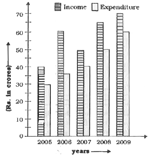
- Study the following graph which shows income and expenditure of a comp...
Text Solution
|
- Study the following graph which shows income and expenditure of a comp...
Text Solution
|
- Study the following graph which shows income and expenditure of a comp...
Text Solution
|
- In the following bar diagram sales of books (in thousand numbers) from...
Text Solution
|
- In the following bar diagram sales of books (in thousand numbers) from...
Text Solution
|
- In the following bar diagram sales of books (in thousand numbers) from...
Text Solution
|
- In the following bar diagram sales of books (in thousand numbers) from...
Text Solution
|
- In the following bar diagram sales of books (in thousand numbers) from...
Text Solution
|
- Study the following graph which shows the production (in thousand) of ...
Text Solution
|
- Study the following graph which shows the production (in thousand) of ...
Text Solution
|
- Study the following graph which shows the production (in thousand) of ...
Text Solution
|
- Study the following graph which shows the production (in thousand) of ...
Text Solution
|
- Study the following graph which shows the production (in thousand) of ...
Text Solution
|
- Study the bar diagram and answer the questions. Percentage fall i...
Text Solution
|
- Study the bar diagram and answer the questions. The difference be...
Text Solution
|
- Study the bar diagram and answer the questions. Value per bag was...
Text Solution
|
- Study the bar diagram and answer the questions. The approximate p...
Text Solution
|
- Study the following bar-diagram and answer the questions. In how ...
Text Solution
|
- Study the following bar-diagram and answer the questions. The ave...
Text Solution
|
- Study the following bar-diagram and answer the questions. The max...
Text Solution
|