A
B
C
D
Text Solution
Verified by Experts
The correct Answer is:


Topper's Solved these Questions
STATISTICS AND DATA INTERPRETATION
KIRAN PUBLICATION|Exercise TYPE-V|38 VideosSTATISTICS AND DATA INTERPRETATION
KIRAN PUBLICATION|Exercise TYPE-VI|86 VideosSTATISTICS AND DATA INTERPRETATION
KIRAN PUBLICATION|Exercise TYPE-III|39 VideosSIMPLIFICATION
KIRAN PUBLICATION|Exercise TEST YOURSELF|25 VideosTIME AND DISTANCE
KIRAN PUBLICATION|Exercise Type -XI|74 Videos
Similar Questions
Explore conceptually related problems
KIRAN PUBLICATION-STATISTICS AND DATA INTERPRETATION-TYPE-IV
- The following chart represents Demand and Production for 5 companies A...
Text Solution
|
- The following chart represents Demand and Production for 5 companies A...
Text Solution
|
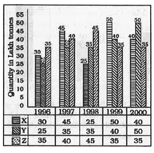
- The bar graph provided below gives the data of the production of paper...
Text Solution
|
- The bar graph provided below gives the data of the production of paper...
Text Solution
|
- The bar graph provided below gives the data of the production of paper...
Text Solution
|
- The bar graph provided below gives the data of the production of paper...
Text Solution
|
- The bar graph provided below gives the data of the production of paper...
Text Solution
|
- A constituency is divided in four regions A, B, C and D. Two candidate...
Text Solution
|
- A constituency is divided in four regions A, B, C and D. Two candidate...
Text Solution
|
- A constituency is divided in four regions A, B, C and D. Two candidate...
Text Solution
|
- A constituency is divided in four regions A, B, C and D. Two candidate...
Text Solution
|
- The data given in Bar diagram relate to the department wise admission ...
Text Solution
|
- The data given in Bar diagram relate to the department wise admission ...
Text Solution
|
- The data given in Bar diagram relate to the department wise admission ...
Text Solution
|
- The data given in Bar diagram relate to the department wise admission ...
Text Solution
|
- Study the following bar graph showing the percentage of children who c...
Text Solution
|
- Study the following Bar Graph and answer the questions. The Bar Graph ...
Text Solution
|
- Study the following Bar Graph and answer the questions. The Bar Graph ...
Text Solution
|
- Study the following Bar Graph and answer the questions. The Bar Graph ...
Text Solution
|
- Study the following Bar Graph and answer the questions. The Bar Graph ...
Text Solution
|