A
B
C
D
Text Solution
Verified by Experts
The correct Answer is:


Topper's Solved these Questions
IMO MODEL TEST PAPER 2
SCIENCE OLYMPIAD FOUNDATION |Exercise Everyday Mathematics |10 VideosIMO MODEL TEST PAPER 2
SCIENCE OLYMPIAD FOUNDATION |Exercise Achievers Section |5 VideosIMO MODEL TEST PAPER - 1
SCIENCE OLYMPIAD FOUNDATION |Exercise Achievers Section|5 VideosIMO QOESTION PAPER 2017-18 SET-B
SCIENCE OLYMPIAD FOUNDATION |Exercise EVERYDAY MATHEMATICS |10 Videos
Similar Questions
Explore conceptually related problems
SCIENCE OLYMPIAD FOUNDATION -IMO MODEL TEST PAPER 2 -Achievers Section
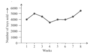
- The given line graph shows the number of toys sold by a toy company in...
Text Solution
|
- Which of the following statements is sufficient to answer the followin...
Text Solution
|
- Which of the following statements is CORRECT ? (i) If two geometric ...
Text Solution
|
- Match the following. {:(,"Column-I",,"Column-II"),((P),[(5^(3))^(2)...
Text Solution
|
- Which of the following steps is INCORRECT while constructing triangleX...
Text Solution
|
- Fill in the blanks. • The underline(P) The P consist of natural numb...
Text Solution
|