A
B
C
D
Text Solution
Verified by Experts


Topper's Solved these Questions
Similar Questions
Explore conceptually related problems
BITSAT GUIDE-HEAT, TEMPERATURE AND CALORIMETRY-Bitsat archives
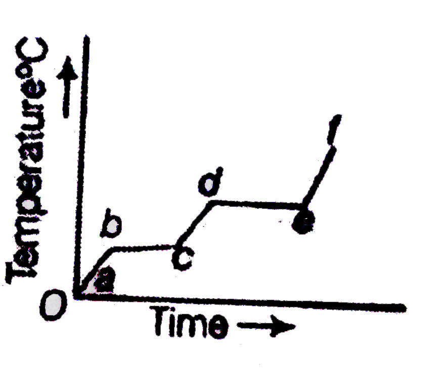
- The following figure represents the temperature versus time plot for a...
Text Solution
|
- In an experiment on the specific heat of a metal a 0.20 kg block of th...
Text Solution
|
- A partition wall has two layers of different materials A and B in cont...
Text Solution
|
- A monoatomic gas (gamma=5//3) is suddenly compressed to (1//8) of its ...
Text Solution
|
- 1 g of water (volume 1 cm^(3) becomes 1671 cm^(3) of steam when boiled...
Text Solution
|
- The end A of rod AB of length 1 m is maintained at 80^(@)C and the end...
Text Solution
|
- One junction of a certain thermoelectric couple is at a fixed temperat...
Text Solution
|
- In a 10 m deep lake, the bottom is at a constant temperature of 4^(@)C...
Text Solution
|
- A metal string is fixed between rigid supports. It is initially at neg...
Text Solution
|
- There is some change in length when a 33000 N tensile force is applied...
Text Solution
|