Text Solution
Verified by Experts


Topper's Solved these Questions
BAR GRAPH, HISTOGRAM AND FREQUENCY POLYGON
RS AGGARWAL|Exercise EXAMPLE|11 VideosBAR GRAPH, HISTOGRAM AND FREQUENCY POLYGON
RS AGGARWAL|Exercise EXERCISE 17A|12 VideosAREAS OF TRIANGLES AND QUADRILATERALS
RS AGGARWAL|Exercise Multiple Choice Questions (Mcq)|16 VideosCIRCLES
RS AGGARWAL|Exercise MULTIPLE CHOICE QUESTION(MCQ)|37 Videos
Similar Questions
Explore conceptually related problems
RS AGGARWAL-BAR GRAPH, HISTOGRAM AND FREQUENCY POLYGON-EXERCISE 17B
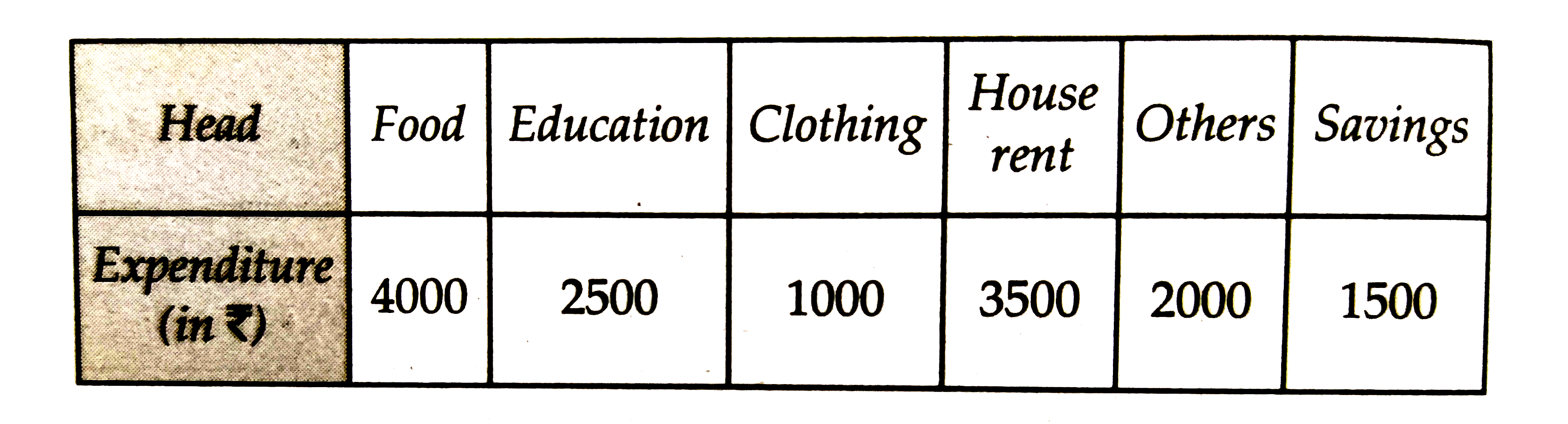
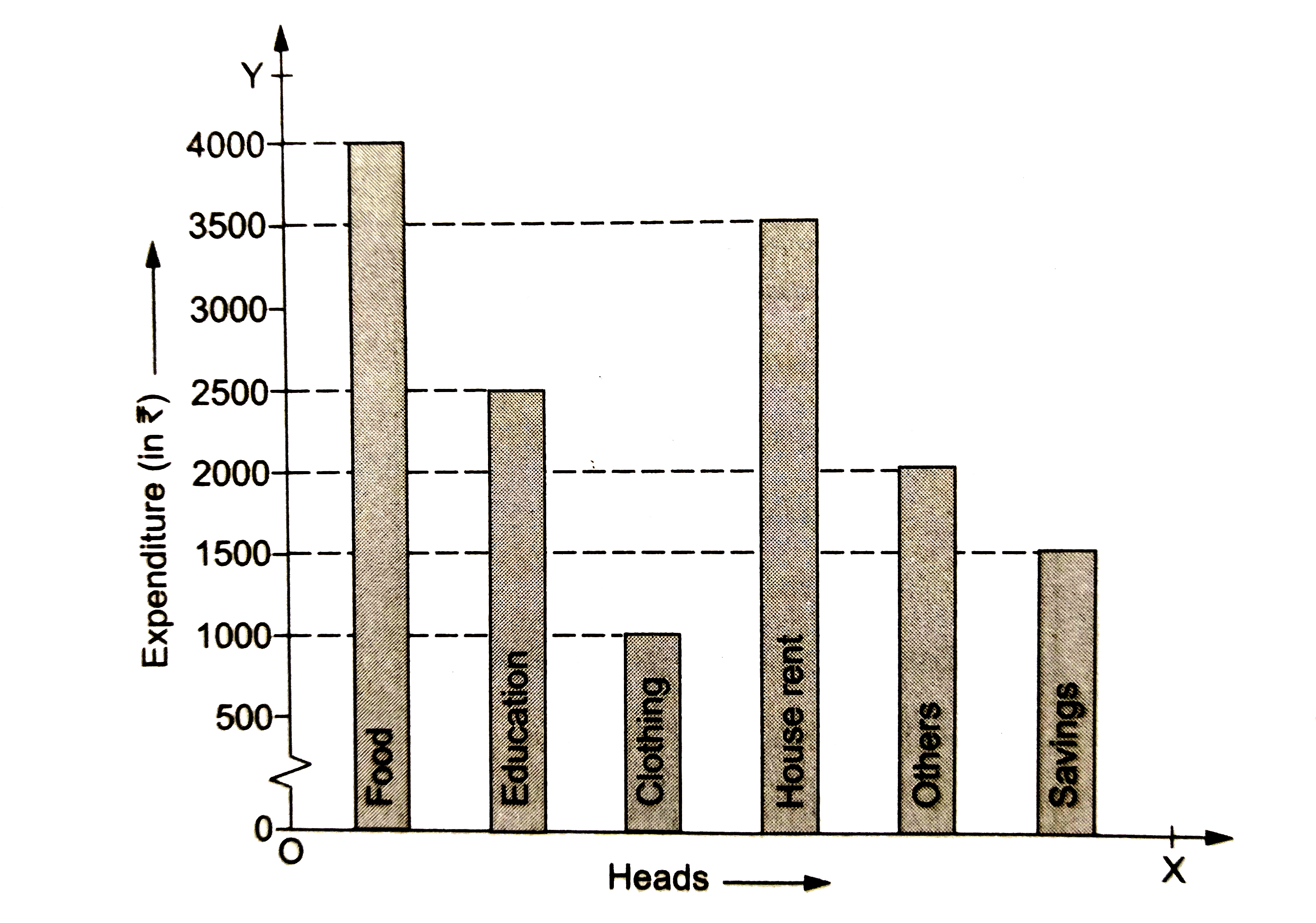
- The expenditure of a family on different heads in a month is given bel...
Text Solution
|
- The daily wages of 50 workers in a factory are given below: Const...
Text Solution
|
- The following table shows the average daily earnings of 40 general sto...
Text Solution
|
- The heights of 75 students in a school are given below: Draw a hi...
Text Solution
|
- The following table gives the lifetimes of 400 neon lamps: (i) Re...
Text Solution
|
- Draw a histogram for the frequency distribution of the following data:
Text Solution
|
- Construct a histogram for the following frequency distribution:
Text Solution
|
- The following table shows the number of illiterate persons in the age ...
Text Solution
|
- Draw a histogram to represent the following data:
Text Solution
|
- 100 surnames were randomly picked up from a local telephone directory ...
Text Solution
|
- Draw a histogram to represent the following information:
Text Solution
|
- Draw a his togram to represent the following information:
Text Solution
|
- In a study of diabetic patients in a village, the following observatio...
Text Solution
|
- Draw a frequency polygon for the following frequency distribution:
Text Solution
|
- The ages (in years) of 360 patients treated in a hospital on a particu...
Text Solution
|
- Draw a histogram and the frequency polygon from the following data:
Text Solution
|
- Draw a histogram for the following data: Using this histogram, dr...
Text Solution
|