Home
Class 9
MATHS
The following data on the number of girl...

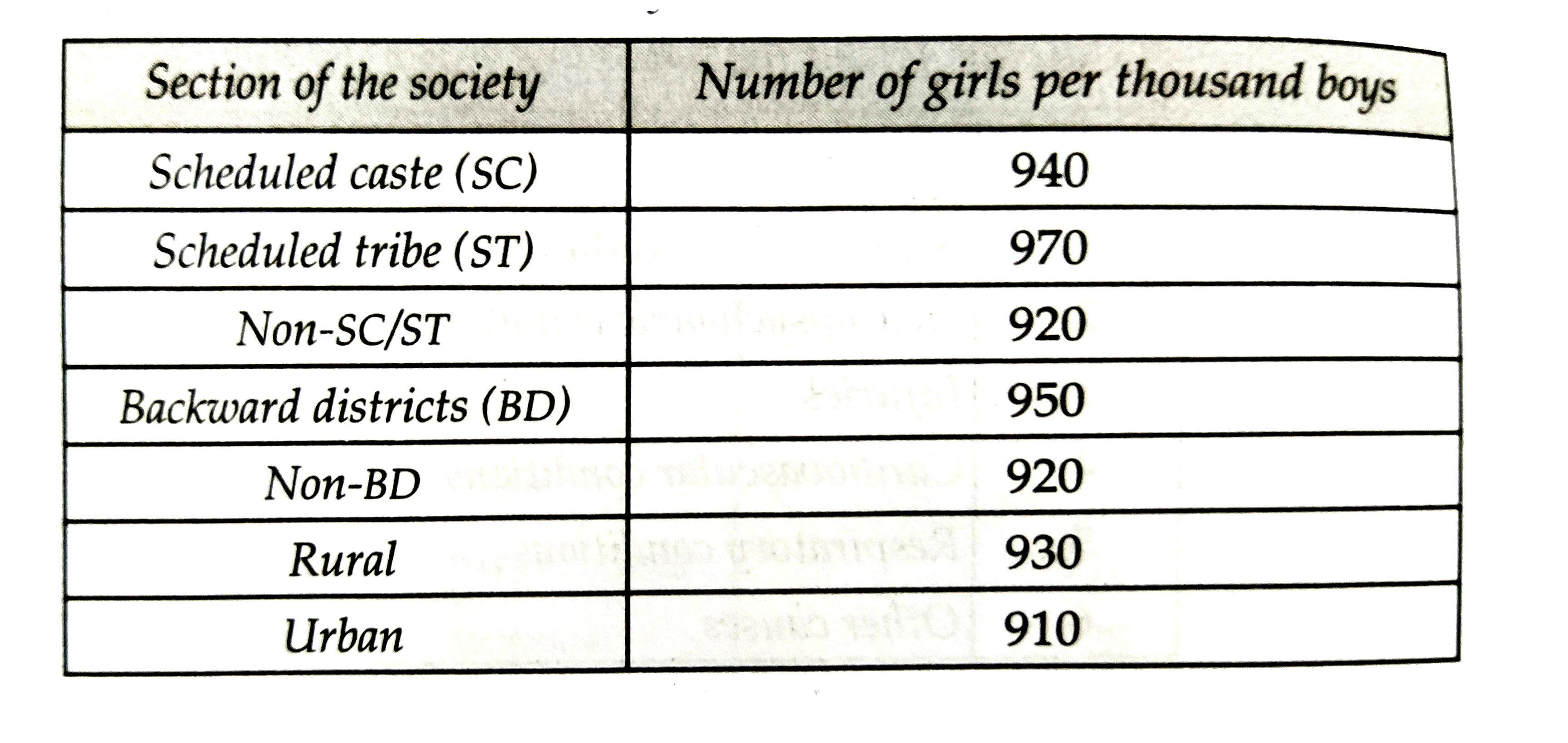
The following data on the number of girls per thousand boys different sections of the society is given below:

(i) Represent the above information by a bar graph.
(ii) Write two conclusions derived from the graph with justification.

Text Solution

Verified by Experts

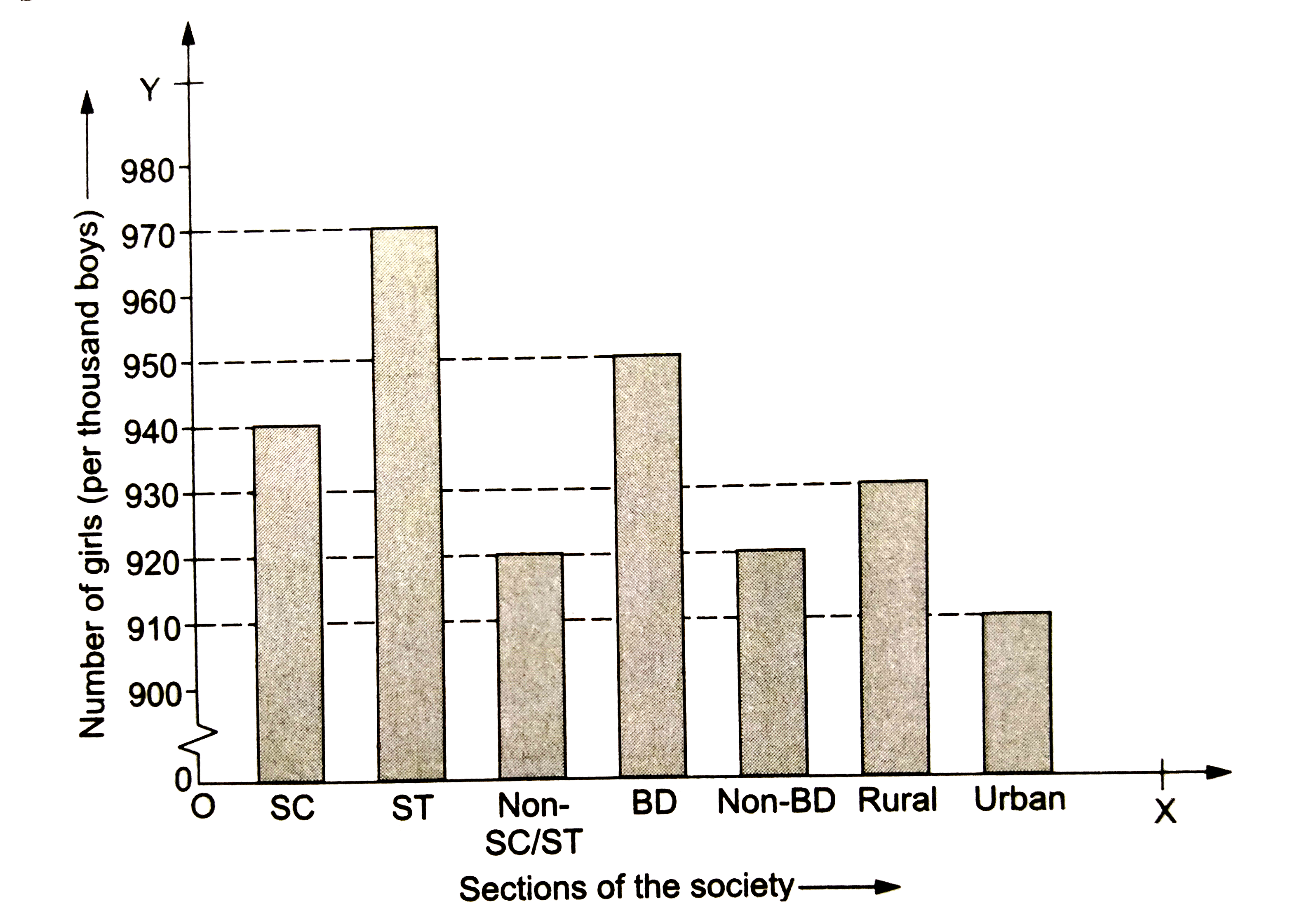
We denote the different sections of the society along the `x`-axis and the corresponding number of girls (per thousand boys) along the `y`-axis. Draw the bars of the same width having their heights proportional to the number of girls, keeping the same space between two consecutive bars, as shown below.

(i) The given information has been represented above graphically.
(ii) From the graph, it is clear that the number of girls per thousand boys, is maximum in schedule tribes and it is minimum in urban.
Promotional Banner

Topper's Solved these Questions

  • BAR GRAPH, HISTOGRAM AND FREQUENCY POLYGON

    RS AGGARWAL|Exercise EXAMPLE|11 Videos
  • BAR GRAPH, HISTOGRAM AND FREQUENCY POLYGON

    RS AGGARWAL|Exercise EXERCISE 17A|12 Videos
  • AREAS OF TRIANGLES AND QUADRILATERALS

    RS AGGARWAL|Exercise Multiple Choice Questions (Mcq)|16 Videos
  • CIRCLES

    RS AGGARWAL|Exercise MULTIPLE CHOICE QUESTION(MCQ)|37 Videos

Similar Questions

Explore conceptually related problems

The following data on the number of girls (to the nearest ten) per thousand boys in different sections of Indian society is given below.

The number of hours spent by a school boy in different activities in a day is given below : Represent the above information using a pie diagram.

The number of hours spent by a school boy in different activities in a day is given below: Represent the above information using pie diagram.

Number of mobile phone users in various age groups in a city is listed below: Draw a bar graph to represent the above information.

The number of ATMs of different banks in a city is shown below: Draw a bar graph to represent the above information by choosing the scale of your choice.

The following data shows the number of students born in different months of a particular year of class VI. Make the bar graph based on the given information.

In a school, there are five sections of Class VI. The number of students in each section is given below: Represent the above data using a bar graph.

Home appliances sold by a shop in one month are given as below: Draw a bar graph to represent the above information.

The following table represents income of a Gram Panchayat from different sources in a particular year: Draw a bar graph to represent the above information

RS AGGARWAL-BAR GRAPH, HISTOGRAM AND FREQUENCY POLYGON-EXERCISE 17B
  1. The following data on the number of girls per thousand boys different ...

    Text Solution

    |

  2. The daily wages of 50 workers in a factory are given below: Const...

    Text Solution

    |

  3. The following table shows the average daily earnings of 40 general sto...

    Text Solution

    |

  4. The heights of 75 students in a school are given below: Draw a hi...

    Text Solution

    |

  5. The following table gives the lifetimes of 400 neon lamps: (i) Re...

    Text Solution

    |

  6. Draw a histogram for the frequency distribution of the following data:

    Text Solution

    |

  7. Construct a histogram for the following frequency distribution:

    Text Solution

    |

  8. The following table shows the number of illiterate persons in the age ...

    Text Solution

    |

  9. Draw a histogram to represent the following data:

    Text Solution

    |

  10. 100 surnames were randomly picked up from a local telephone directory ...

    Text Solution

    |

  11. Draw a histogram to represent the following information:

    Text Solution

    |

  12. Draw a his togram to represent the following information:

    Text Solution

    |

  13. In a study of diabetic patients in a village, the following observatio...

    Text Solution

    |

  14. Draw a frequency polygon for the following frequency distribution:

    Text Solution

    |

  15. The ages (in years) of 360 patients treated in a hospital on a particu...

    Text Solution

    |

  16. Draw a histogram and the frequency polygon from the following data:

    Text Solution

    |

  17. Draw a histogram for the following data: Using this histogram, dr...

    Text Solution

    |