Text Solution
Verified by Experts


Topper's Solved these Questions
BAR GRAPH, HISTOGRAM AND FREQUENCY POLYGON
RS AGGARWAL|Exercise EXERCISE 17A|12 VideosBAR GRAPH, HISTOGRAM AND FREQUENCY POLYGON
RS AGGARWAL|Exercise EXERCISE 17B|16 VideosBAR GRAPH, HISTOGRAM AND FREQUENCY POLYGON
RS AGGARWAL|Exercise EXERCISE 17B|16 VideosAREAS OF TRIANGLES AND QUADRILATERALS
RS AGGARWAL|Exercise Multiple Choice Questions (Mcq)|16 VideosCIRCLES
RS AGGARWAL|Exercise MULTIPLE CHOICE QUESTION(MCQ)|37 Videos
Similar Questions
Explore conceptually related problems
RS AGGARWAL-BAR GRAPH, HISTOGRAM AND FREQUENCY POLYGON-EXAMPLE
- Represent the following frequency distribution by means of a histogram...
Text Solution
|
- Draw a histogram of the following distribution:
Text Solution
|
- Depict the following frequency distribution by a histogram:
Text Solution
|
- The following table shows the number of literate females in the age gr...
Text Solution
|
- The lengths of 62 leaves of a plant are measured in millimetres and th...
Text Solution
|
- Following is the frequency distribution of the total marks obtained by...
Text Solution
|
- A random survey of the number of children of various age groups playin...
Text Solution
|
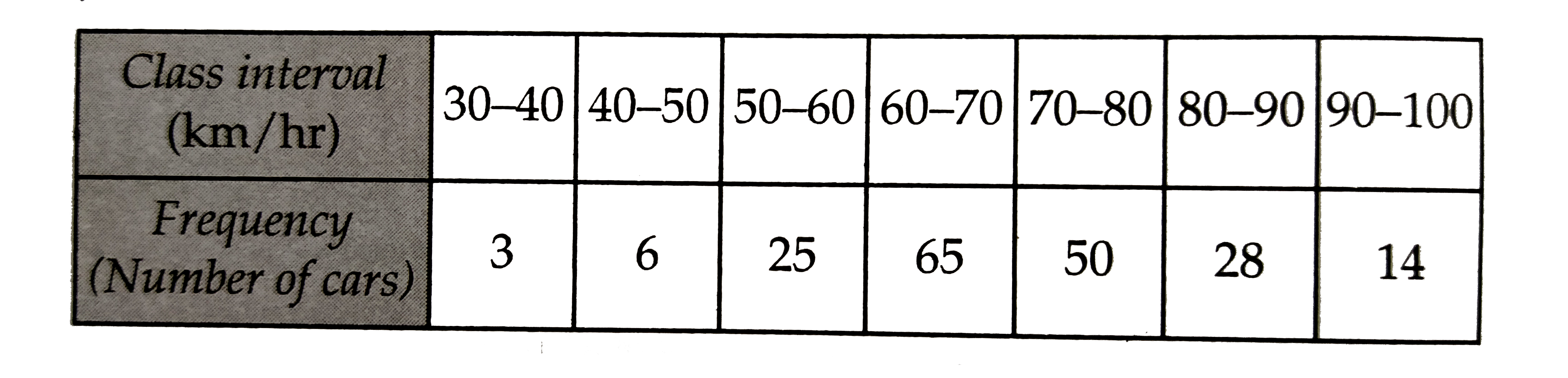
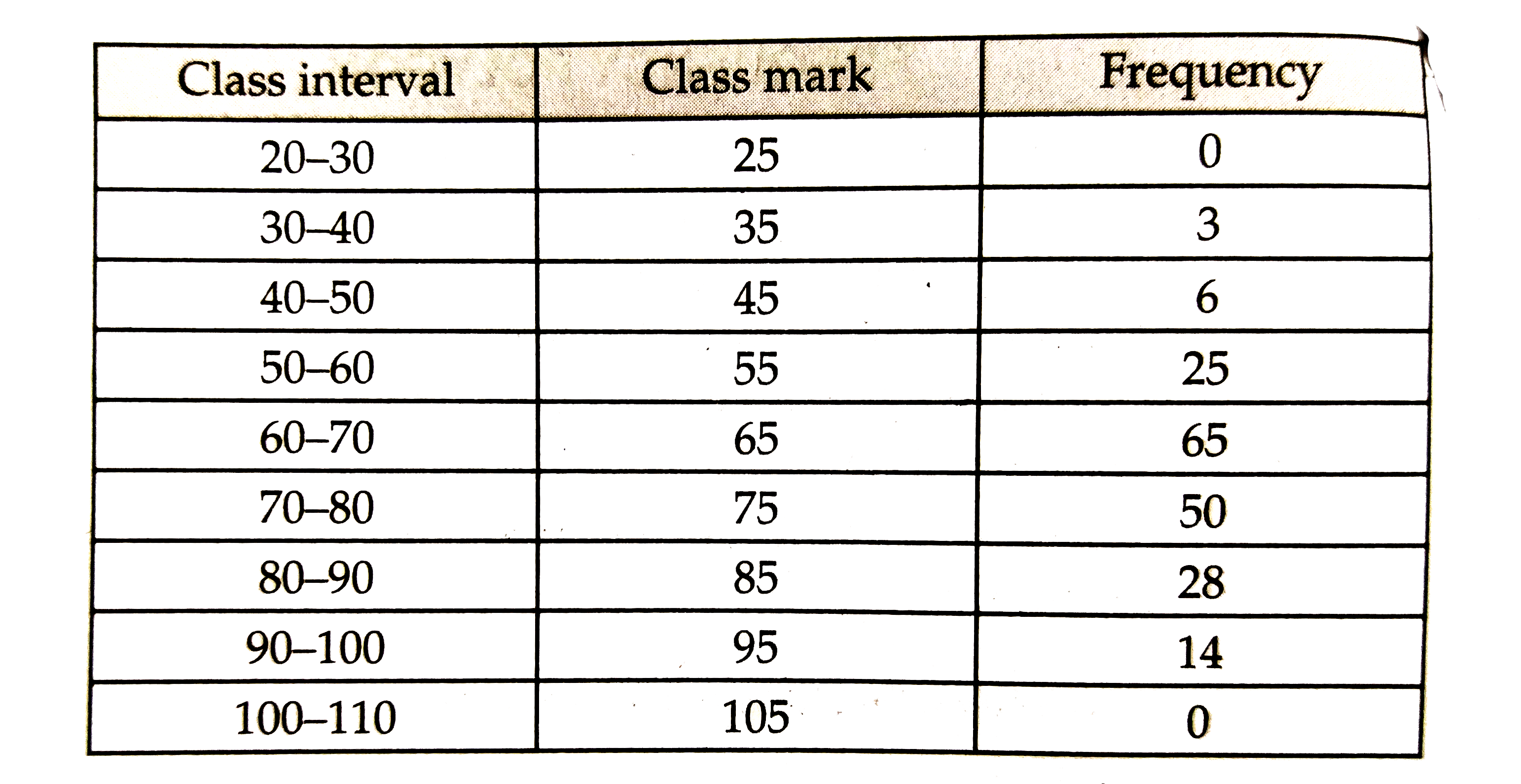
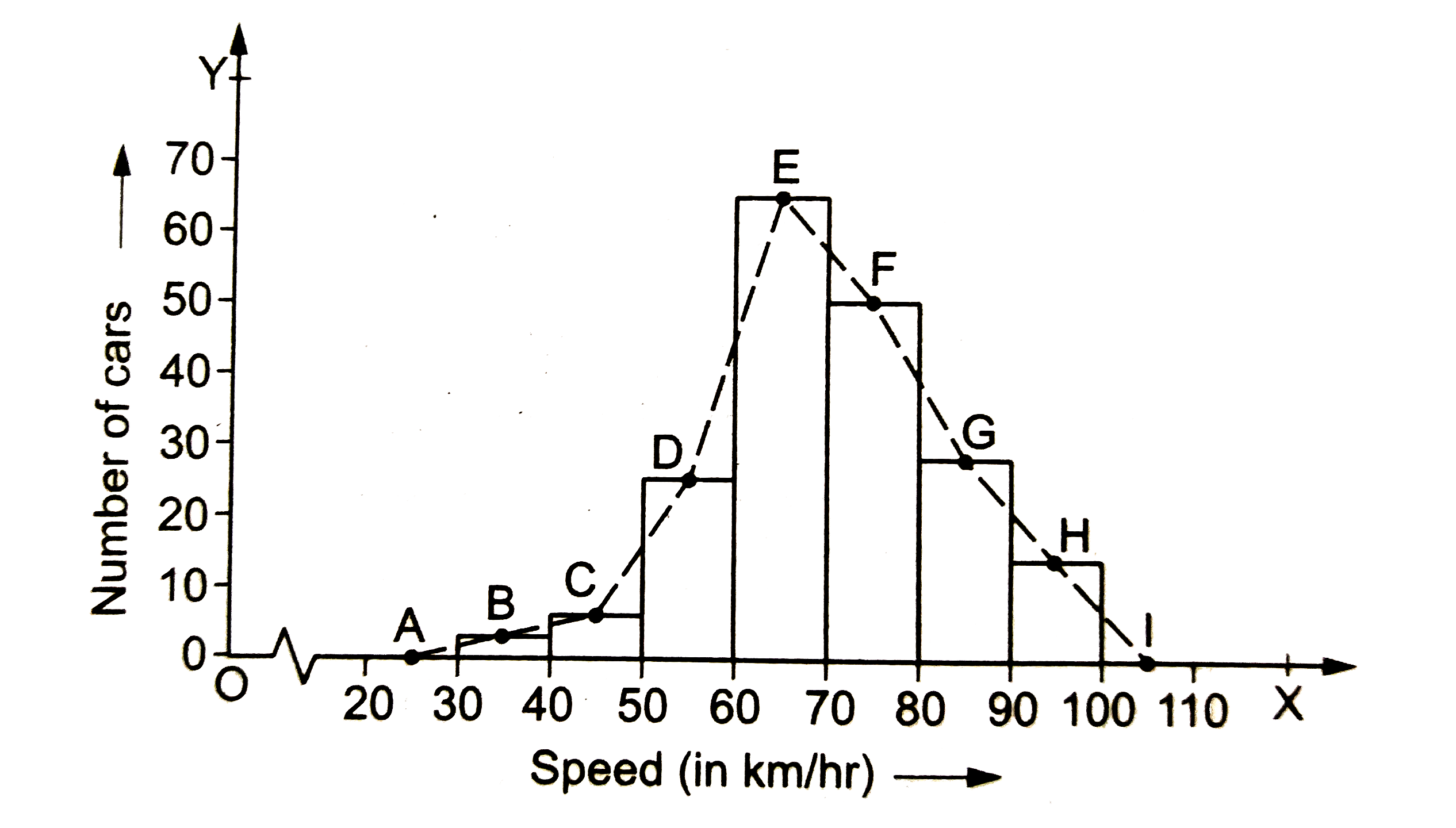
- Following table shows a frequency distribution for the speeds of cars ...
Text Solution
|
- The daily pocket expenses of 150 students in a school are given below:...
Text Solution
|
- Draw the frequency polygon representing the following frequency distri...
Text Solution
|
- The following two tables give the distribution of students of two sect...
Text Solution
|