


Topper's Solved these Questions
BAR GRAPH, HISTOGRAM AND FREQUENCY POLYGON
RS AGGARWAL|Exercise EXERCISE 17B|16 VideosBAR GRAPH, HISTOGRAM AND FREQUENCY POLYGON
RS AGGARWAL|Exercise EXAMPLE|11 VideosAREAS OF TRIANGLES AND QUADRILATERALS
RS AGGARWAL|Exercise Multiple Choice Questions (Mcq)|16 VideosCIRCLES
RS AGGARWAL|Exercise MULTIPLE CHOICE QUESTION(MCQ)|37 Videos
Similar Questions
Explore conceptually related problems
RS AGGARWAL-BAR GRAPH, HISTOGRAM AND FREQUENCY POLYGON-EXERCISE 17A
- The following table shows the number of students participating in vari...
Text Solution
|
- On a certain day, the temperature in a city was recorded as under: ...
Text Solution
|
- The approximate velocities of some vehicles are given below: Draw...
Text Solution
|
- The following table shows the favourite sports of 250 students of a sc...
Text Solution
|
- Given below is a table which shows the yearwise strength of a school. ...
Text Solution
|
- The following table shows the number of scooters sold by a dealer duri...
Text Solution
|
- The air distances of four cities from Delhi (in km) are given below ...
Text Solution
|
- The birth rate per thousand in five countries over a period of time is...
Text Solution
|
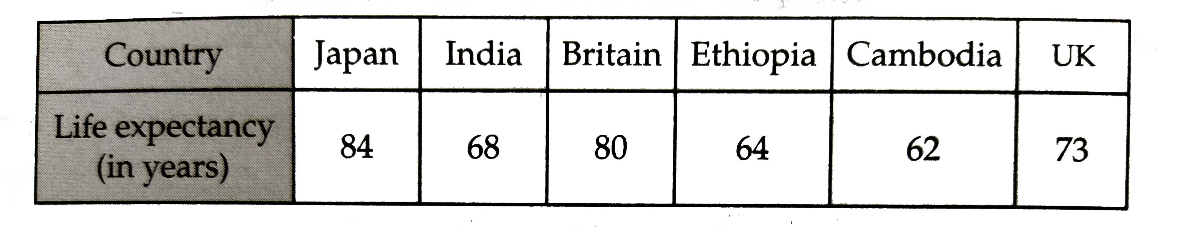
- The following table shows the life expectancy (average age to which pe...
Text Solution
|
- Given below are the seats won by different political parties in thepol...
Text Solution
|
- Various modes of transport used by 1850 students of a school are given...
Text Solution
|
- Look at the bar graph given below. Read it carefully and answer t...
Text Solution
|